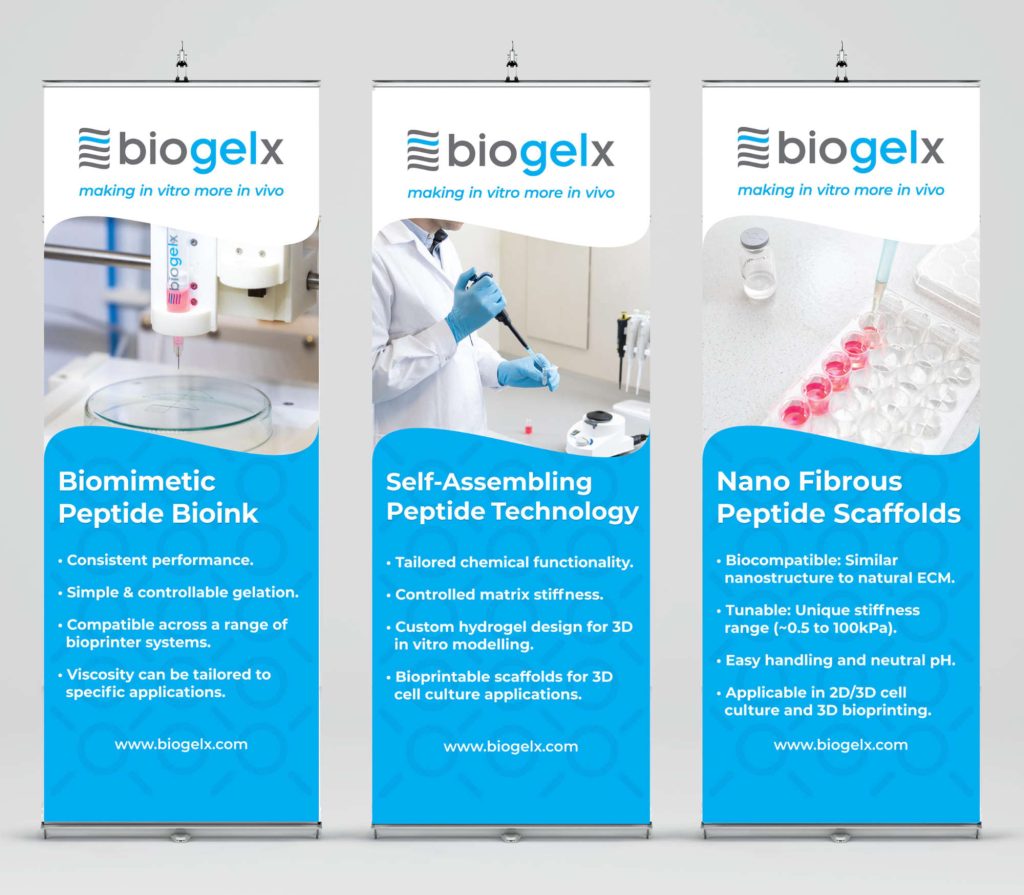

Establishing a cervical cancer diagnostics company.
Starting from the ground floor with this client I was tasked with creating a suitable logo to get the organisation visually established. The company name was given and the logo-form is highly suggestive of the nature of the diagnostics. Typography is clean and modern while still being female focused as is the colour.
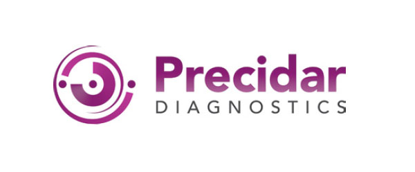

The logo design was extracted over key design items to display a congruent organisational experience. This is seen clearly across the specification sheet.
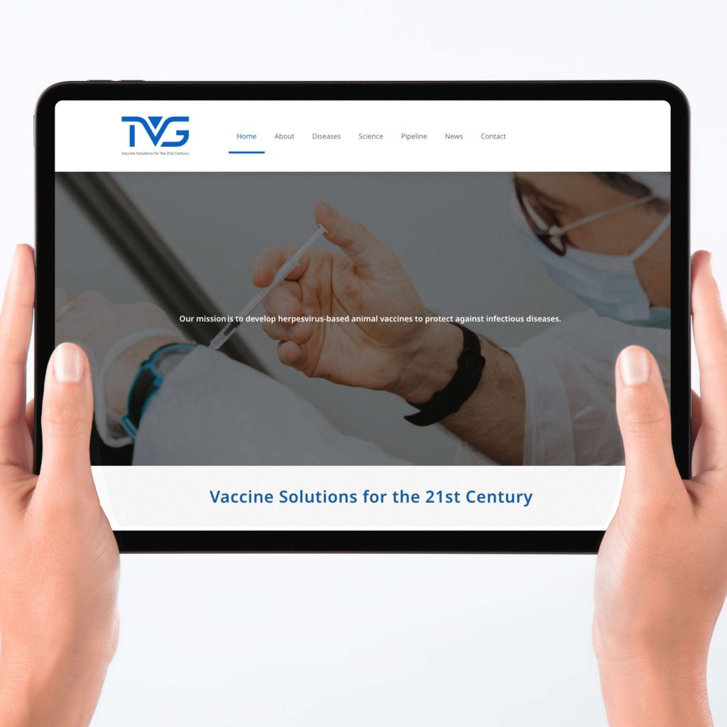
A company website was a core design item required by the company. WordPress was used to get started quickly and to make it easy to hand the site off to the management team for long-term maintenance. The logo and branding elements with succinct photography were applied well to give confidence to customers and potential investors.
Having attended several events held at the Edinburgh BioQuarte, I was remembered and were contacted to deliver a costed proposal for: logo and branding design, specification sheet and website for the new diagnostics company in the field of viral cervical cancer.
Female diagnostics required significant research from it being unfamiliar to me. The sector is rather narrow and is highly clinical but with huge opportunity to create something new.
Logo and branding solutions were visually accurate to the nature and processes of the Precidar Diagnostics. The website using WordPress was agreed with key management as they felt confident using it. The stationery, specification sheet and website all worked together to show the organisation.
A clean company identity was quickly and effectively crafted and applied to the required design items. The specification sheet and website are highly informative and were stated to be valuable assets the management used to share their company and value proposition.